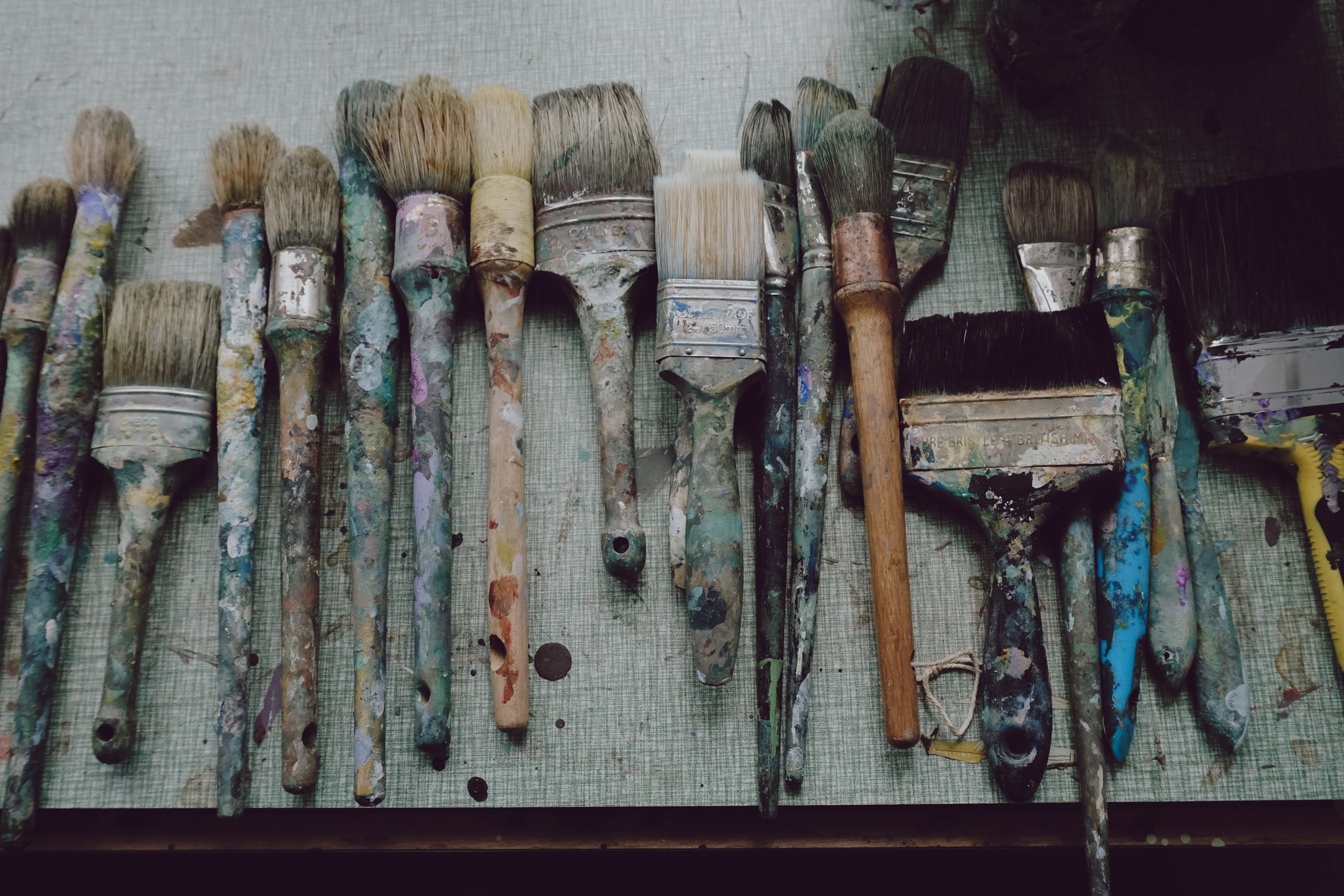
My paintings evolve from a process of observing shapes, forms and colours in nature, around where I live near the South Downs, and also further a field. The paintings are characterised by distinct colour palettes and gestural marks, that I hope capture the movement and atmosphere of the landscape. Layered and woven colour and interlocking shapes provide depth and rhythm. Dark blues, greens and grey hues contrast with tints of red, orange and yellow; darkness contrasts with light, shade with luminosity. Colours and marks reveal themselves and new forms emerge, layer over layer, linking back to a memory of a time and place.

Exhibitions
2025: The Winter Show, The Art Buyer and Friends, Hampton Court
2025: Affordable Art Fair, Battersea with Cameron Contemporary Art
2025: The Control Tower, West Malling - mixed show
2024: Winter Show, Cameron Contemporary Art, Brunswick Town House, Hove
2024: Sea-Saw, Fishing Quarter Gallery, Brighton
2024: Sea-Saw, Nairn Community & Arts Centre, Scotland
2023: Winter Show, The Art Buyer, Thames Ditton
2023: Spring Show, The Art Buyer, Thames Ditton
2023: Festival, Cameron Contemporary Art, Hove
2022: Press + Play: Festival of Print, Phoenix Art Space, Brighton
2022: From the Land: Contemporary Landscape Paintings, Lancashire
2022: Drawn to Painting, Window Gallery Phoenix Art Space, Brighton
2022: 7, Phoenix Art Space, Brighton
2022: Festival, Cameron Contemporary Art, Hove
2022: Time + Place, Cameron Contemporary Art, Hove
2021: Winter Show, Cameron Contemporary Art, Hove
2021: Rhubarb Designs, British Columbia, Canada
2021: Affordable Art Fair Battersea (with CAA)
2021: Festival, Cameron Contemporary Art, Hove
2021: Care, Window Gallery Phoenix Art Space, Brighton
2020: Winter Show, Cameron Contemporary Art, Hove
2020: Affordable Art Fair, online (with CCA)
2019: Winter Show, Cameron Contemporary Art, Hove
Chapter 2: studio visit
Fay Murphy from Chapter 2 visited the studio to discuss painting, shoe making and the creative process. Chapter 2 make traditionally crafted boots and shoes with a focus on simple yet beautiful details. A palette of earthy tones and soft leathers embrace the shades and textures of the changing seasons. You can read the photo story here(all photos by Fay Murphy)
Time + Place: studio visit
Jane Campling is a committed painter. Intriguingly, when I paid her a studio visit recently she was at pains to stress that she does not identify as a ‘landscape artist’. As a fellow painter this made sense to me but we wondered if her audience would understand. After all, she paints within the landscape tradition.
But then painting is akin to thinking in action and to invention and to discovering. It’s also intensely physical - including moments of just sitting and pondering in between busy periods of activity. On one level we can separate walking, drawing and painting quite easily but as a practitioner (and even avoiding the term/label ‘artist’) these various aspects coalesce in lived reality.
Campling makes paintings that can be viewed meditatively and purely for themselves or with recourse to some vestige of landscape memories, special times and lived experiences from the viewer. If labels such as landscape or abstraction serve a purpose for the viewer that is fine, but I challenge you to consider the works without these labels to get closer to what they are. It’s difficult for sure, as we have become so accustomed to learning ways of seeing and adopting forms of categorisation. We unavoidably read imagery and visualise from within traditions, but we sometimes need to remind ourselves (artists and audiences alike) that conventions can become distorting filters that close down rather than open up seeing clearly.
Campling’s project appears to be celebratory about the subject matter that is both external (the landscape) and internal (the actual, visual/physical outcome that is placed within the rectangle). We might have a sense of the fleeting reality of nature from her works, of the sometimes restless moment, and are coaxed into acknowledging the discord as well as the harmony of the physical world. Her work is characterised by a gestural form of shorthand, quick decision-making, and working with qualities and traits of the paint medium.
Expertly she knows when (and how) to hold back and not to over paint. She knows when to start as well as when to stop, employing a subtle expressionism that approaches a cohesive colour/shape minimalism. Surprisingly perhaps, her work is not decorative in the sense of superficiality, but is attractive and engaging nonetheless. Tonal qualities are as important as a clear interest in colour combinations. So too with mark making, whereby the drawn qualities of shape and line might provide contrast or harmony within a composition, especially when the linear content of lines and edges coalesce so well. Layered and woven colour shapes are consistently under control to provide depth and rhythm, so that the viewer’s looking is active.
If you are fortunate enough to view Campling’s work in the gallery space or in the privacy of your own home imagine all filters removed. Her work evidences drawing into painting, seamlessly. Time and place as experience is here too - the viewer’s time and place. Despite the unavoidable fixity of artworks made on paper or canvas, we know that time is not immutable but is defined by that unfathomable state of flux and flow. To define or fix would be to diminish the experience itself.
Geoff Hands, February 2022